Redlining Health
May 28, 2020 | Updated Nov. 20, 2020
by Alexander Fella | alex@theurcnorfolk.com
is more than a virus. A pandemic is the real loss of human life, and livelihoods a virus leaves in its wake. A pandemic is everything from our collective past that goes into shaping that loss. And a pandemic begins to take shape long before any novel virus appears on the scene. Behind the statistics of disparate health inequalities lies a longer history that left neighborhoods vulnerable to a public health emergency. For Norfolk, and much of urban America, decades of segregationist housing policies, like redlining, began shaping the current pandemic before COVID-19 hit. When the virus finally came, it found a perfect host in the already unhealthy body of our neighborhoods.
In recent weeks, media attention has shifted to whether or not COVID-19 was produced intentionally, if it was man-made. There’s no evidence to support that claim, but there is evidence that the historical conditions that left neighborhoods vulnerable to public health emergencies over the years were man-made. One local, and federal, policy that has had a lasting impact on building vulnerable neighborhoods was redlining. In Norfolk, Virginia, the same neighborhoods that were redlined during the 1940s have been ranked some of the most vulnerable to a health crisis.
How does one determine a vulnerable neighborhood? The Center for Disease Control produces a statistic they call a Social Vulnerability Index, or SVI. A neighborhood’s SVI is determined by a basket of 15 different factors. The CDC looks at data on: race, gender, and age, as well as income, unemployment, high school diploma status, single parent households, English language ability, vehicle ownership, housing density, and group quarters, as well as other socio-economic points. For example, if a neighborhood’s residents live below the poverty line, in high density housing, work part-time, and do not own a car, then they are more vulnerable to a public health emergency. That a neighbor who, say, owns a single-family home, a car, and has a steady income.
A short history of how our neighborhoods became segregated nationally, and in Norfolk, Virginia. Part of the Urban Renewal Center's forum on Gentrification t...
Redlining is the process by which mortgage loans, and housing insurance, were denied to people living in neighborhoods deemed too risky to invest in. Overwhelmingly, these neighborhoods were predominantly African American. In the 1930s and 1940s, Norfolk was redlined. The government-backed Home Owners’ Loan Corporation produced maps of Norfolk that outlined, in red ink, neighborhoods they deemed “hazardous.” Yellow neighborhoods were deemed “declining,” due to the imminent “threat of infiltration of foreign-born, negro, or lower grade populations.” Blue and Green neighborhoods were without “a single foreigner or Negro,” thus deemed 'safer’ for investment.
Half of all the redlined neighborhoods in Norfolk were entirely African American. Neighborhoods that were redlined include today’s Calvert Square, Tidewater Gardens, and Young Park. Additionally, parts of Ghent were redlined along with Lamberts Point, Brambleton, Titustown, Berkley, and nearly all of Portsmouth. Today, these neighborhoods remain almost overwhelmingly black and overwhelmingly poor- with the exception of Ghent, which was gentrified between in 1960s and 1970s. Additionally, Norfolk’s neighborhoods that were redlined have some of the highest Social Vulnerability Indices in the country. Indeed, comparing redlining maps from the 1940s with the CDC’s Social Vulnerability Map from 2018, one can see the haunting legacy of segregated housing coming to bear on critically vulnerable neighborhoods today.
Mapping Inequality/ University of Richmond

CDC/US Census/ ACS 5-year Estimate SVI Index Map (2018) ARCGIS. The darker shades of purple represent a higher vulnerability index. The white shades represent lower vulnerability indices.
Now, at this distance it may be tough to notice the patterns between which neighborhoods were redlined and which neighborhoods have a high vulnerability today. Partly, this is because the vulnerability maps are based on follow census tracts which have changed since the 1940s. Focusing on few neighborhoods will make the point more clear. Most glaring on the vulnerability map above is the large swath of dark purple vulnerability that extends from Colonial Place across the river into Portsmouth, encompassing the St. Paul’s quadrant. The three neighborhoods which make up St. Paul’s were all redlined in the 1940s. Today, they have some of the highest SVI indices in the country.

The dark purple borders of the social vulnerability map correspond almost down to the block where these three neighborhoods were redlined almost 80 years ago. Similarly, in Lambert’s Point, which was redlined, and where Old Dominion University is today, their social vulnerability is bordered by Colonial Place, a neighborhood with a relatively low social vulnerability index. Compared to redlined neighborhoods, Ghent, which was colored mostly yellow and blue (indicating safer investment), has significantly lower SVI numbers.

Looking at the borders between Ghent and St. Paul’s, one notices parts of Ghent were redlined, particularly in Atlantic City (where Sentara Hospital is today) and most of Ghent was colored Yellow and Blue. Yet Ghent also has some of the lowest SVI numbers in the country. This is because Ghent was gentrified during the 1960s and 1970s. In the 1940s, much of Ghent was considered slum housing. Historic single-family homes were converted into segregated wartime housing during WWII. After the war, many white residents moved further out of the city into white-only suburban neighborhoods like Ocean View and Larchmont. Ghent fell into disrepair. However during the 1960s and 1970s, Ghent was gentrified. Aided by a federal home loan program, which offered loans to white families who would renovate historic properties, much of Ghent was converted into the affluent suburb it is today. As a result, Ghent’s SVI index is significantly lower than St. Paul’s SVI, despite being separated by only a single street.
Let’s take a look at another example that will draw into sharper focus the lasting legacy of redlining on social vulnerability. Specifically, take Titustown and Algonquin Park as an example:
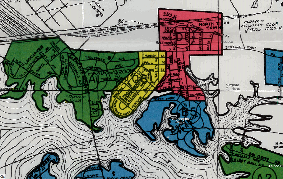
Titustown, a historically black working-class neighborhood, was redlined along Wilmington St., just North of Algonquin Park. Algonquin Park was colored Blue. Today, the Titustown and Algonquin neighborhoods, still divded by Wilmington St., have disparate SVI numbers reminiscent of their redlined past.
While Algonquin Park and St. Paul’s provide visual clues to the effects of redlining on neighborhood vulnerability, they are not the only neighborhoods in Norfolk that bear witness to housing policies 80 years ago. Fully 24 out of 26 redlined neighborhoods across Norfolk and Portsmouth are today neighborhoods with ‘high’ or ‘moderately high’ social vulnerability indices. With the exception of Ghent and Coronado, every historically redlined neighborhood is today a medically vulnerable neighborhood. Additionally, Norfolk’s vulnerability has expanded beyond its redlined neighborhoods to include nearly half the city. 44.4% of all Norfolk residents live in neighborhoods with a high social vulnerability. Close to half of Norfolk is severely unprepared for medical emergencies. Overwhelmingly the vulnerable neighborhoods are communities of color. Worst of all, Norfolk’s vulnerability map is virtually unchanged from 20 years ago. Since the CDC began tracking SVI indices, the same neighborhoods that are vulnerable today were just as vulnerable in the year 2000.
Alternatively, only around 8% of Norfolk lives in neighborhoods with a ‘low’ vulnerability rating. Overwhelmingly the low vulnerability neighborhoods are majority-white neighborhoods that were either gentrified or not redlined in the first place.
Norfolk’s vulnerability map was shaped by Norfolk’s redlining map. But what lies behind the maps? It is one thing to point out a correlation, it’s another to look at the data shaping these graphics. Recall that the CDC uses a number of data points to build its vulnerability map. Redlining has a direct impact on this data. Higher poverty means higher vulnerability. Redlining served to concentrate poverty among minority communities, by denying access to homeownership and the possibility to accumulate wealth. Without opportunities to own homes, many minorities were forced into rent-dependent public housing. Suffering from chronic conditions and comorbidities leads to higher vulnerability. Redlined neighborhoods typically lack services like medical centers and nutritional food sources. Not having a high school diploma determines a higher vulnerability. Redlined neighborhoods were served by segregated schools. In Norfolk’s case, these schools remain segregated today, with higher dropout rates, and an unwavering school-to-prison pipeline. What this means is that redlining brings to the forefront a city’s past which left communities vulnerable today. What lies behind Norfolk’s vulnerability map? A history of racist housing policies.
We are now four months into our current pandemic. So is this virus actually infecting and killing in Norfolk’s vulnerable neighborhoods? It’s still early to say, but preliminary data suggests yes, though not by much. At the time of writing, according to the Virginia Department of Health, which breaks their number down by zip code, areas that are home to socially vulnerable neighborhoods are faring worse. The 23504 zip code, composed mostly of neighborhoods with high SVI’s including St. Paul’s corridor has a little over 50 cases. While across the street in 23507, the affluent majority-white Ghent neighborhood has recorded only 8 cases. Importantly, the amount of testing done has varied widely. In Ghent, only 186 tests have been done, while the 23504 block has recorded over 1000 tests done.
At its core, what all these maps and all this data shows us is that a pandemic does not occur in a vacuum. All the intricate political and historical events in a city’s history inform one another. Redlining policy informs pandemic policy. What a vulnerability map, a redlining map, and an infection map tell us is these things are all connected to each other. And the latter is a point worth remembering. Because while some may be in a neighborhood with low vulnerability, that does not make anyone invulnerable. We are connected to our communities, and if our neighbor across the street is left at risk, then so are we- from more than just COVID-19.
